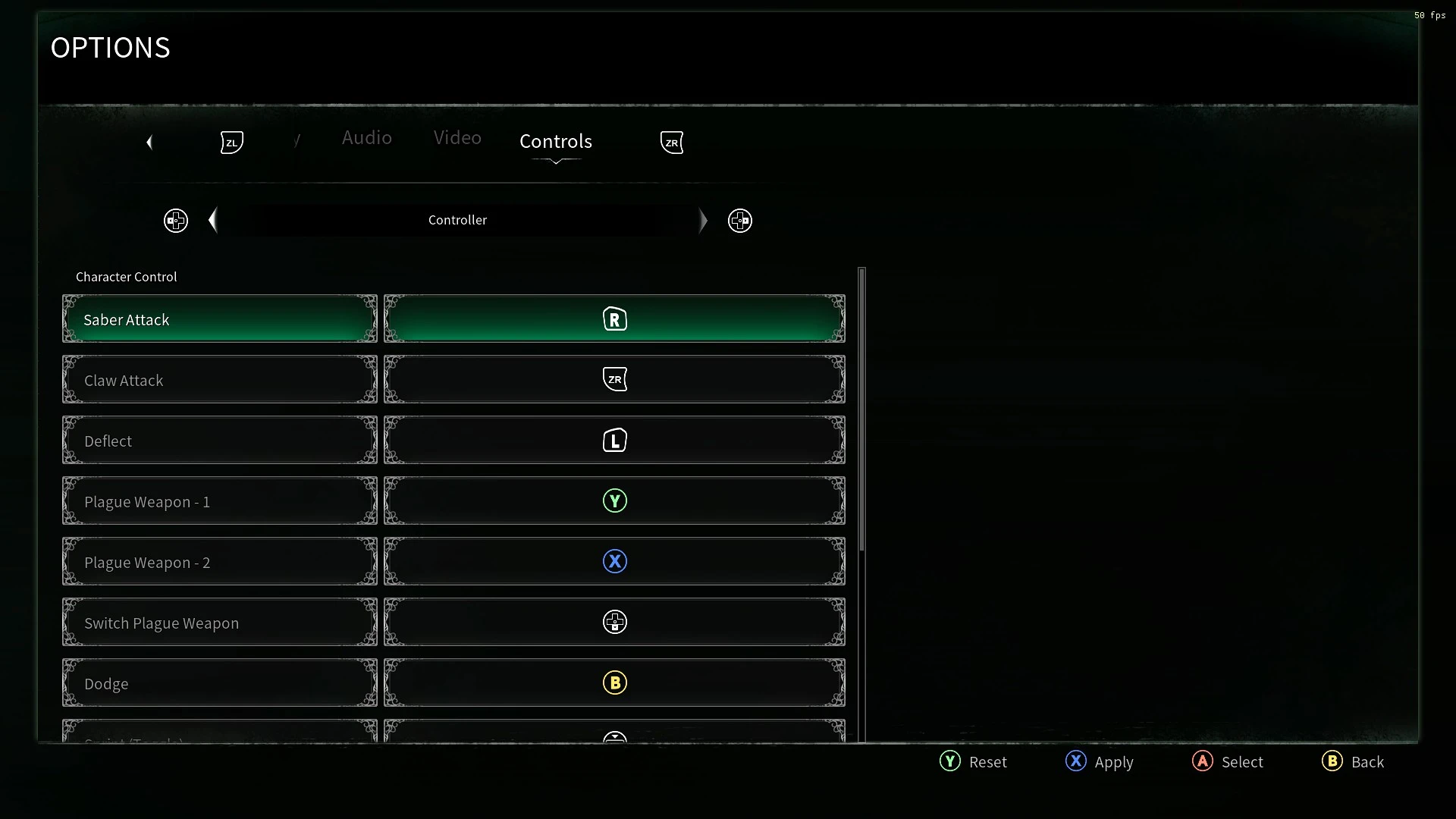
NSX Button Prompts
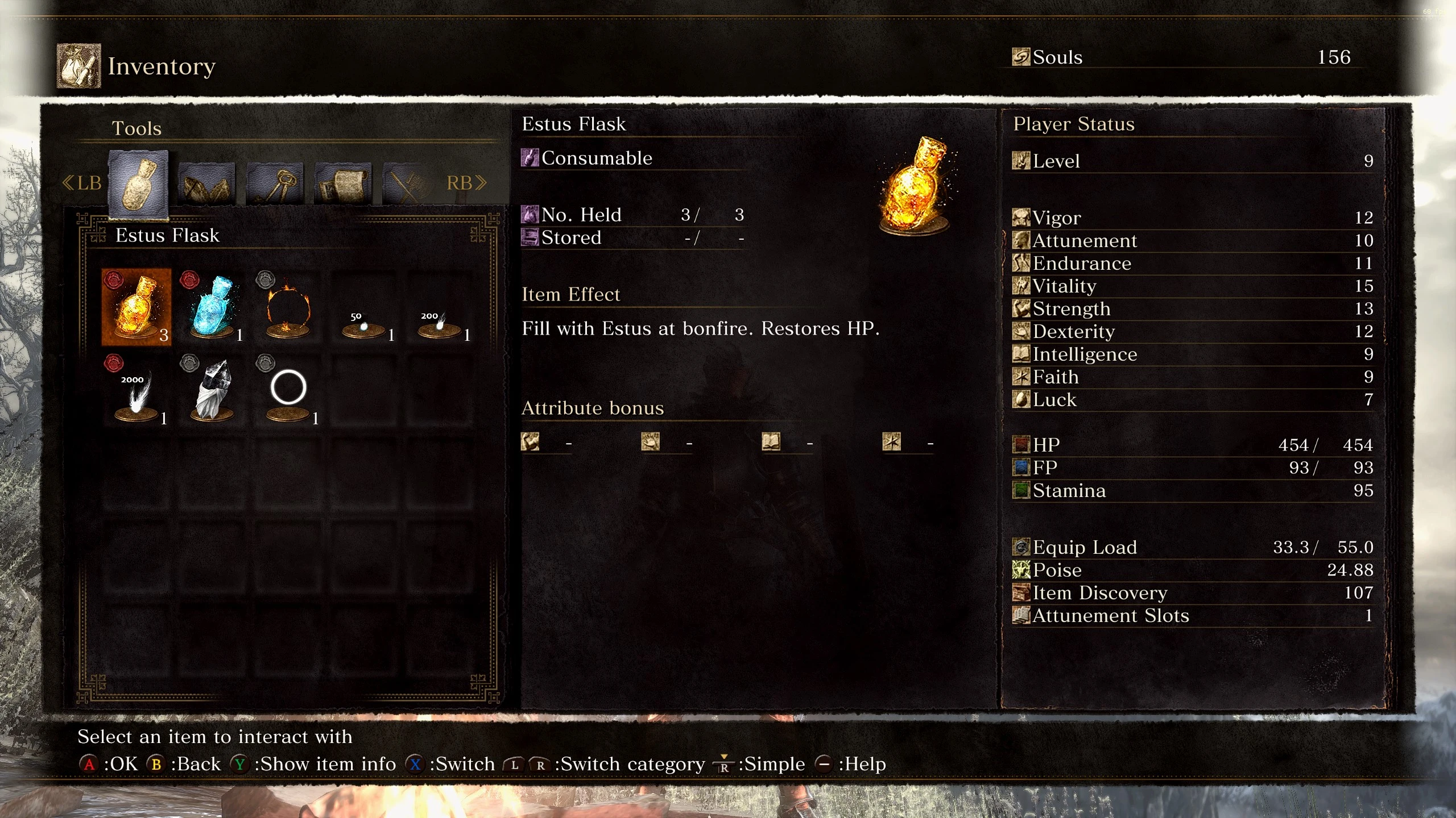
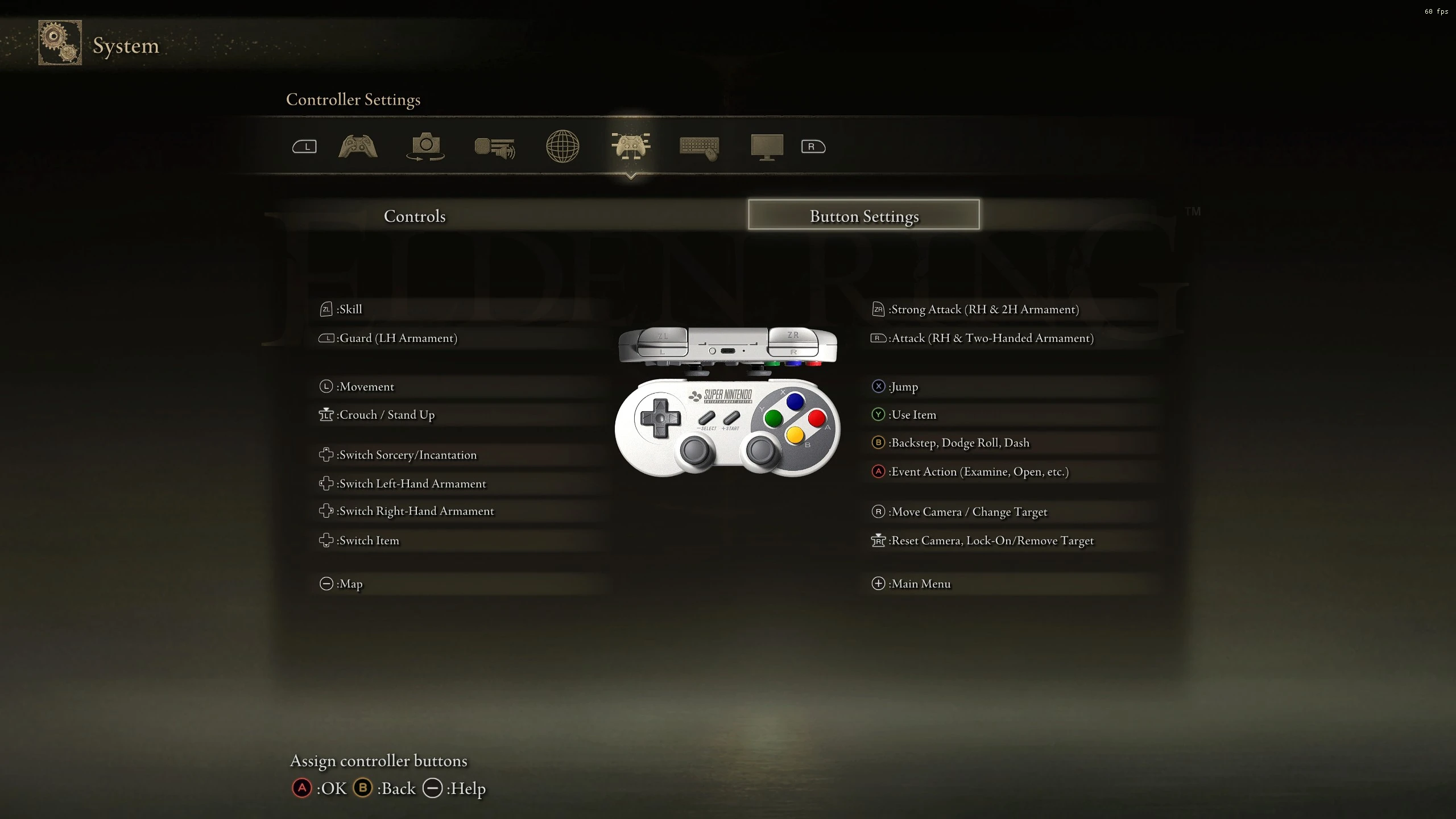
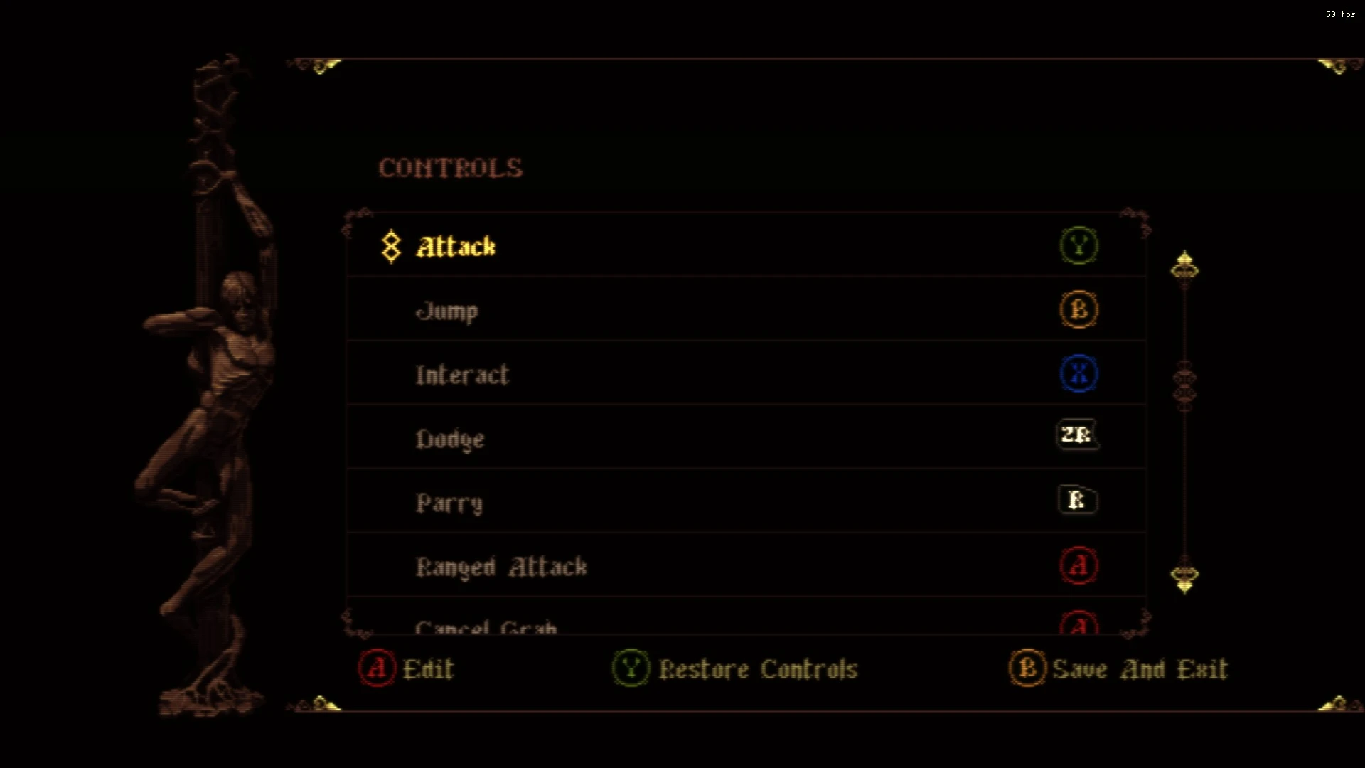
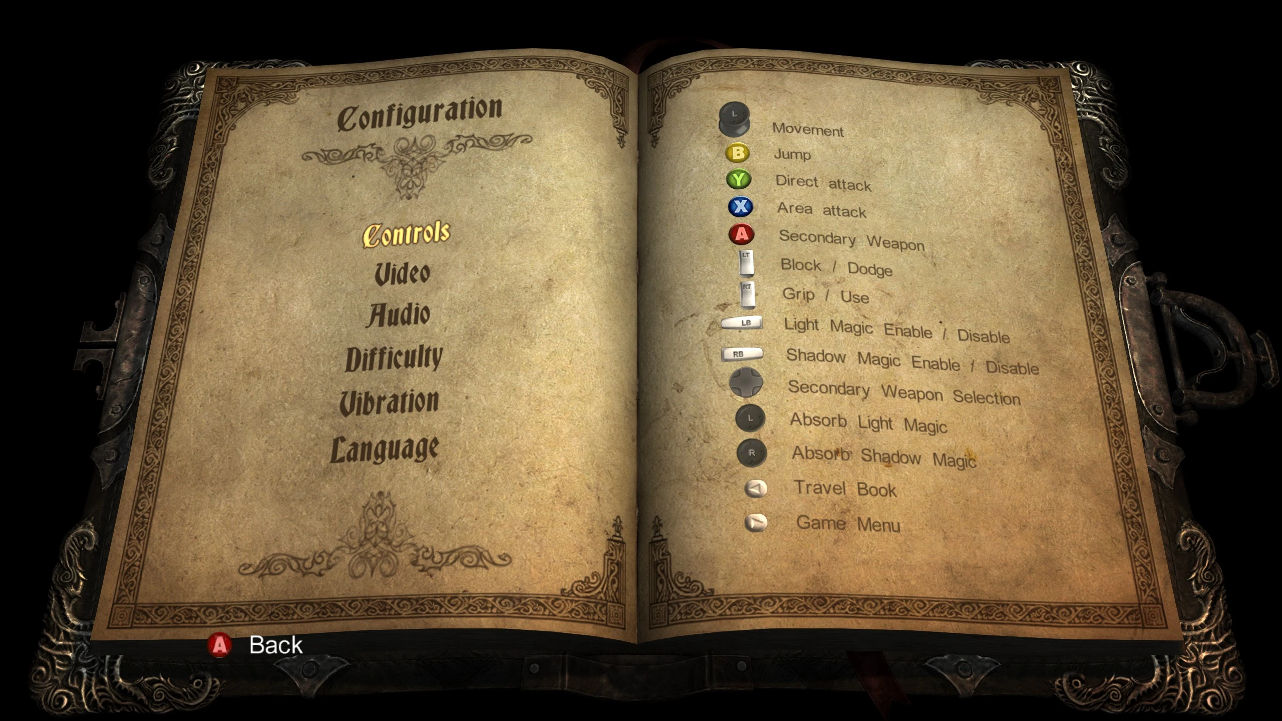
i find the nintendo layout a lot more intuitive, but colours make buttons a lot easier to see at a glance. for this reason, if one doesn't exist, i've started to make a mod for the switch button prompts, but with the snes/sfc colours for the games i play. for games without a way to change the accept/cancel buttons in menus, A/B are the same way around as xinput, allowing one change it via Steam Input or some other method.
From Software
Demon's Souls
- to install:
- unpack
.\USRDIR\from your choice of archive to[rom-directory]\PS3_GAME\
- unpack
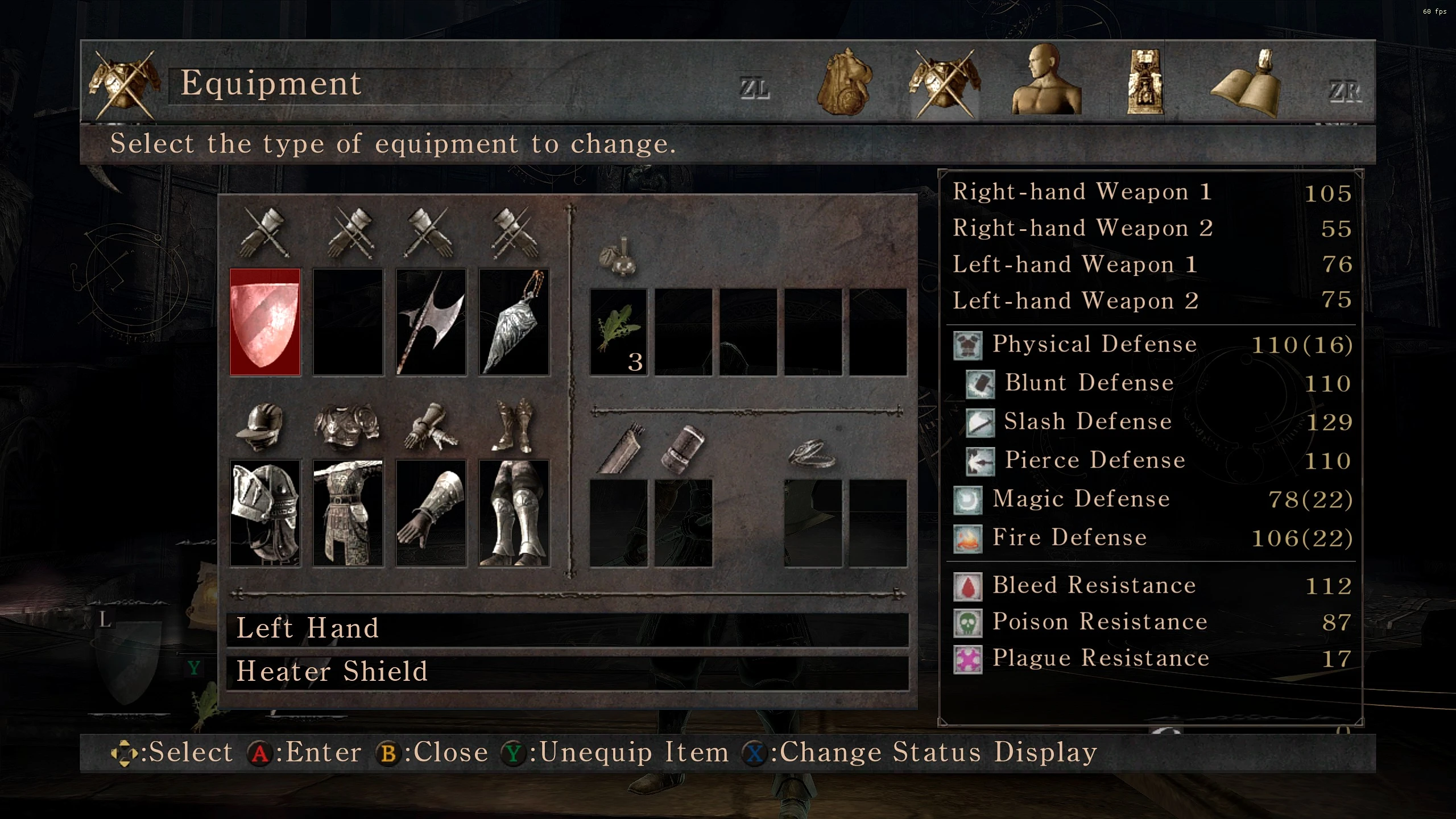
Dark Souls I
- to install remastered:
- download DSR TPUP
- unpack files from .
\Texture Overrideto[TPUP_directory]\Texture Override - run DSR TPUP
- to install ptde:
- /!\ the ptde version is untested, as i don't own ptde, but it should work /!\
- Download DSFix and enable texture override
- Copy png file to
[game_directory]\DATA\dsfix\tex_override
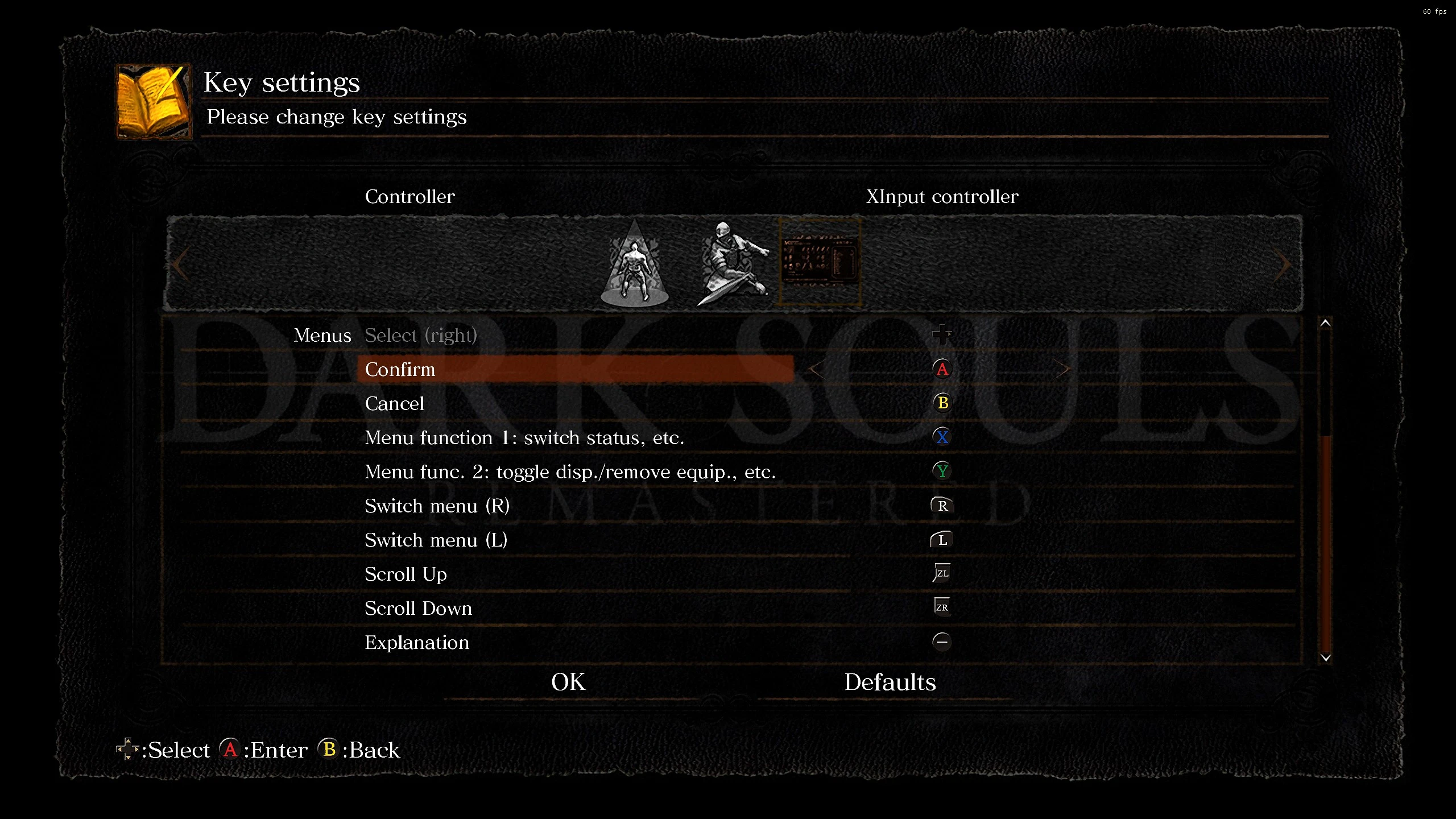
Dark Souls II (SotFS)
- to install with ipg11:
- unpack files from
.\tex_overrideto[game_directory]\game\igp11\tex_override
- unpack files from
- to install manually:
- download no-igp11 file, and unpack from
.\font\to[game_directory]\game\font\- (this version may work with non-sotfs, but it's untested)
- download no-igp11 file, and unpack from
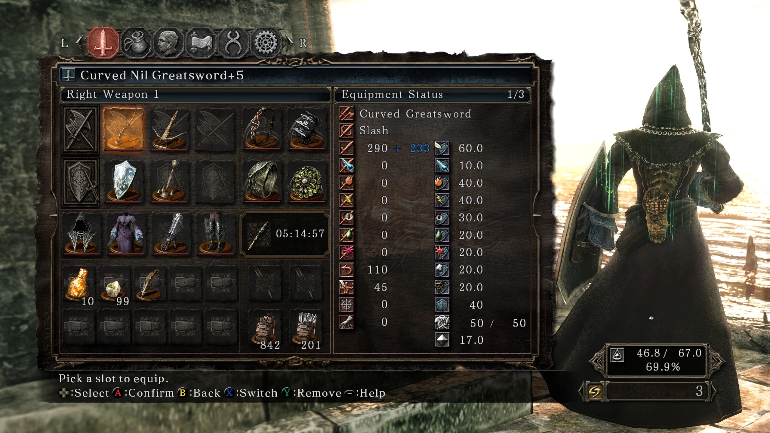
Dark Souls III
- to install with ipg11:
- unpack files from
.\tex_overrideto[game_directory]\game\igp11\tex_override
- unpack files from
Elden Ring
- To install with ModEngine 2:
- Download and extract ModEngine 2
- Unpack mod folder to your mod engine install directory
- One can also rename the mod folder, and add the new name to config_eldenring.toml
- Run game via launchmod_eldenring.bat
- To install with UXM:
- To be honest I don't know, I don't use it
- It should work, but I haven't tested it
Made with ER.BDT.Tool; and Yabber.
It's a lazy implementation, but elden ring makes modding so annoying I couldn't be bothered to do it better. It may be improved in the future, but no promises.
Game Kitchen
Blasphemous
blasphemous is such a good game - if you've never played it, let this page be your catalyst
- to install (simple)
- locate your blasphemous folder
- (by default:
C:\Program Files (x86)\Steam\steamapps\common\Blasphemous)
- (by default:
- (optionally) back up your vanilla
data.unity3dfile- change the file extension or move to another folder, else the game will load slowly
- copy
data.unity3dto yourBlasphemous_Data\
- locate your blasphemous folder
- to install (for merging with other mods)
- follow the import section of this guide
- in step 4, select the texture
all_platform_buttons - load the included
all_platform_buttons-resources.assets-884.png - install as above
/!\ game may load slowly first launch after installation - i'm not quite sure why this is, but it's fine after that
MercurySteam
Castlevania: Lords of Shadow
A & B aren't switched, like they are in my other mods, as i disliked jump being on A. only the face buttons for now, i may update later with back buttons + dpad if i can be arsed
- to install:
- copy
Data00.datto your game directory, overwriting existing file - (a backup of the original file is included for convenient uninstallation, but one can safely ignore it)
- copy
Overborder Studio
Thymesia
i usually only make nintendo button prompts, but as nobody else has done so for this game i thought i'd do all of them
the shoulder icons look squished in the rebinding menu, but they look fine elsewhere ingame
- to install
- locate your game folder
- usually: steam -> ⚙︎ -> manage -> browse local files
- copy
PlagueProject\to your game folder - launch game, and enjoy
- locate your game folder
